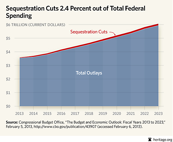
 Above is a chart sent to me by our friends at the Heritage Foundation, which they obtained from a Congressional Budget Office Report. The red line represents the total sequestration “cut” against the field of blue that represents total federal spending.
As you can see, the sequester is a cut to future growth in spending, not an actual cut. Spending continues to skyrocket. – -Josh


